
How can you custom build a report and data visualizations from the data in your OnDataSuite?
After beginning in the Dashboard, choose the type of data that you want to analyze and navigate there.
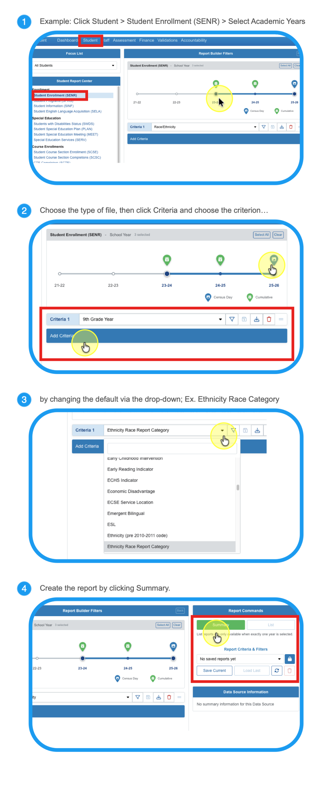
Modify your report to personalize it and shape it to answer your questions.
Step 5
Choose All Students to view by category, or filter to a Focus List.
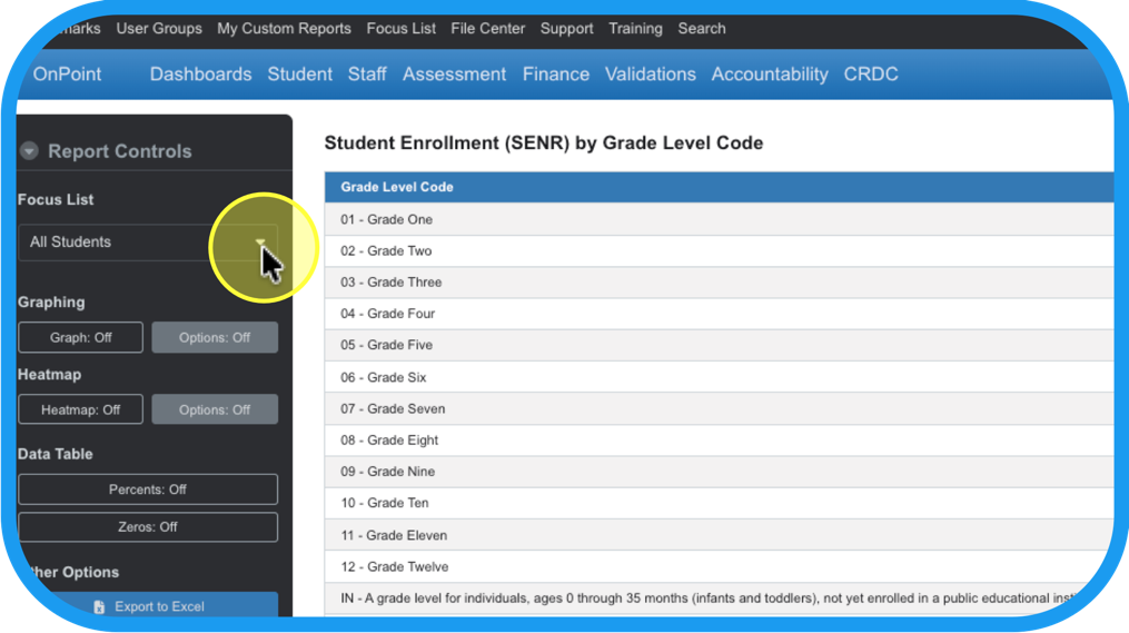
Step 6
In Report Controls, turn on Graphing and Options to make adjustments.
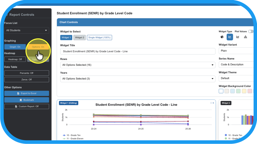
Step 7
Click on the widget (graphing chart) that you want to adjust.
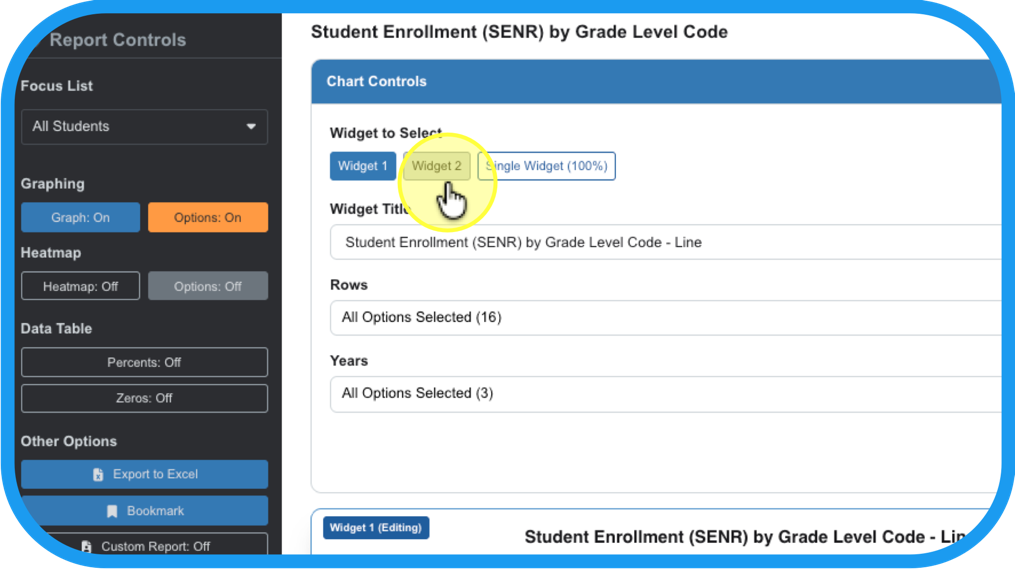
Step 8
Make changes in the structure of the charts and graphs.
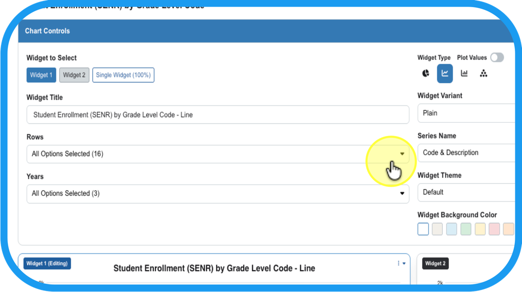
Step 9
Such as: What criteria to use for Rows (y-axis),…
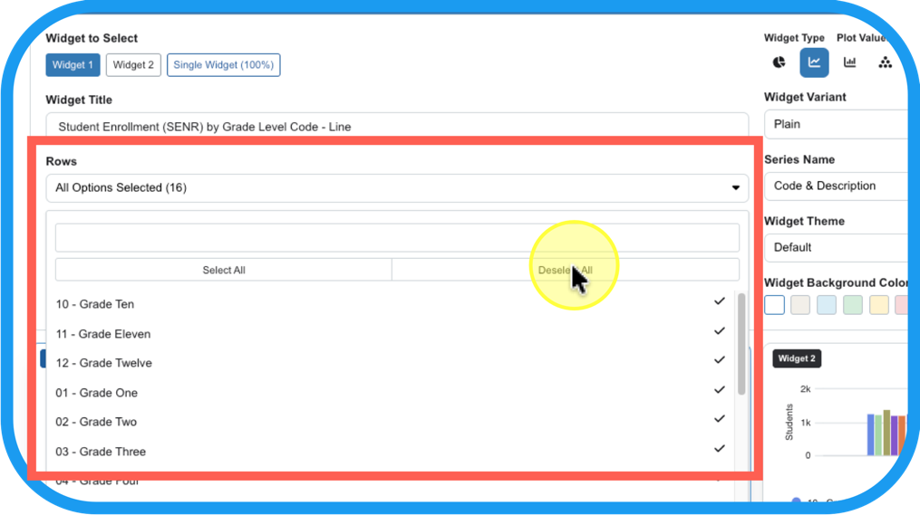
Step 10
and what criteria to use for Years (x-axis),…
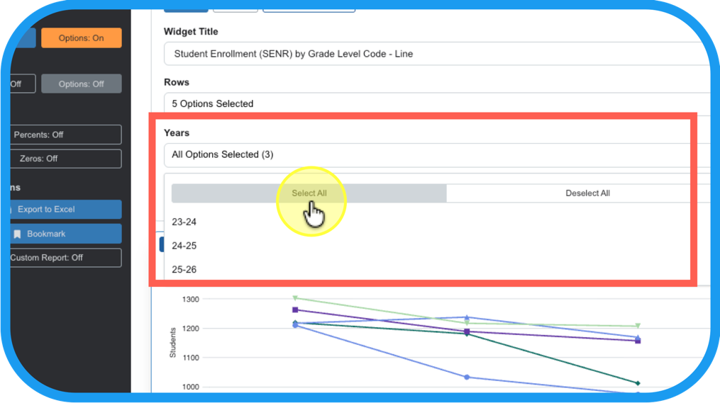
Step 11
swap out the x and y axes by selecting inverse on the Widget Variant,…
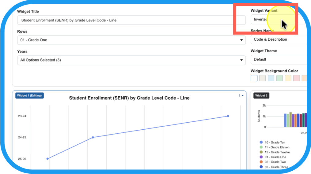
Step 12
And/or change the type of chart in the Widget Type.
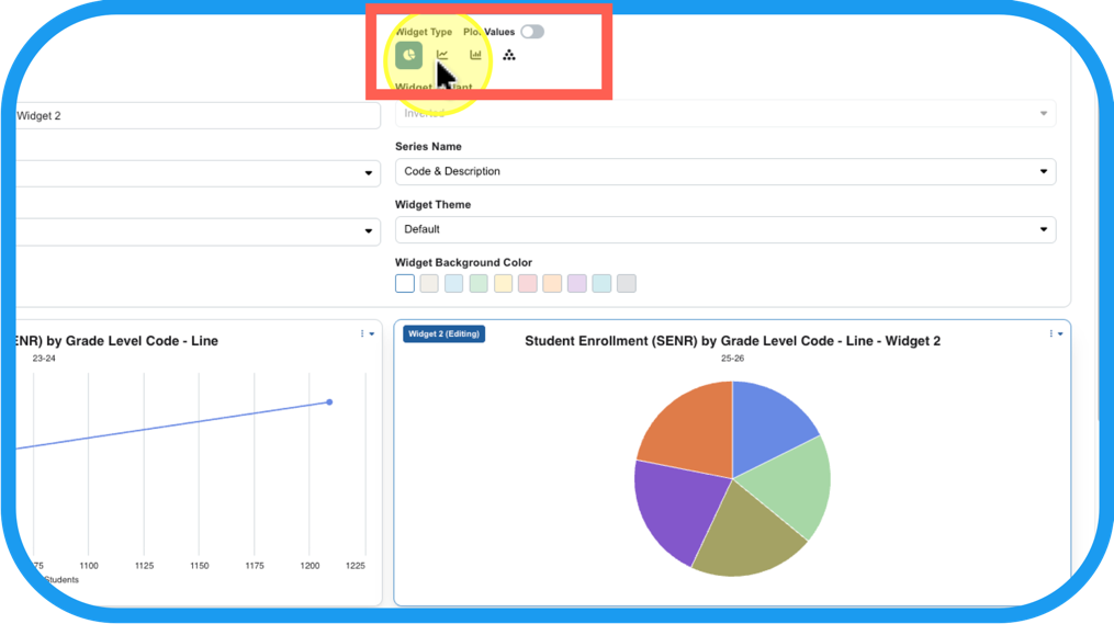
Step 13
Make changes in the details of the charts and graphs. Such as theme, color, …
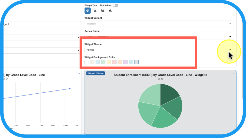
Step 14
description of the data that shows in the tooltip, …
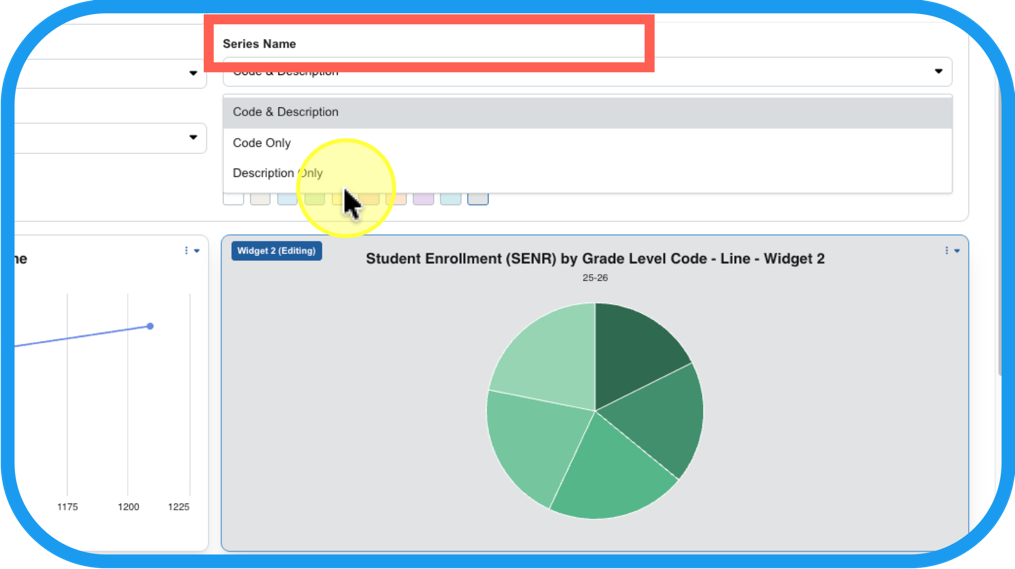
Step 15
and the title of your chart.
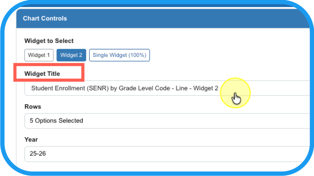
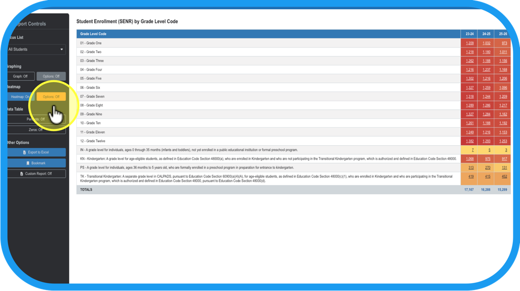
Additionally, you can you can convert the data table from Step 4, into a heatmap. This can assist you with identifying patterns of extreme highs and lows using a gradient color scale.
Step 16
Turn on Heatmap.
Step 17
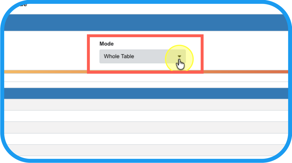
Adjust the details of the heatmap by…
Step 18
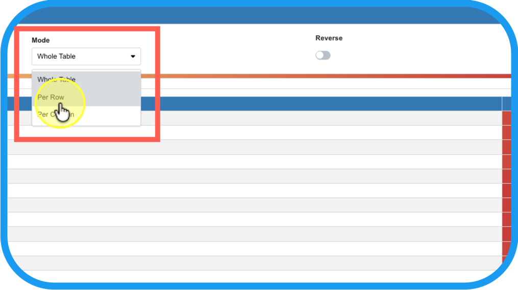
changing the color gradient focus; Ex. across rows (criteria chosen in Step 9), …
Step 19
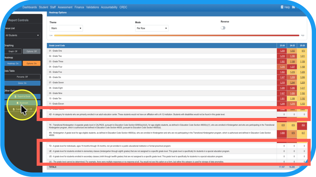
or by adding back in the zeros (criteria are omitted by default if they equal 0)
Step 20
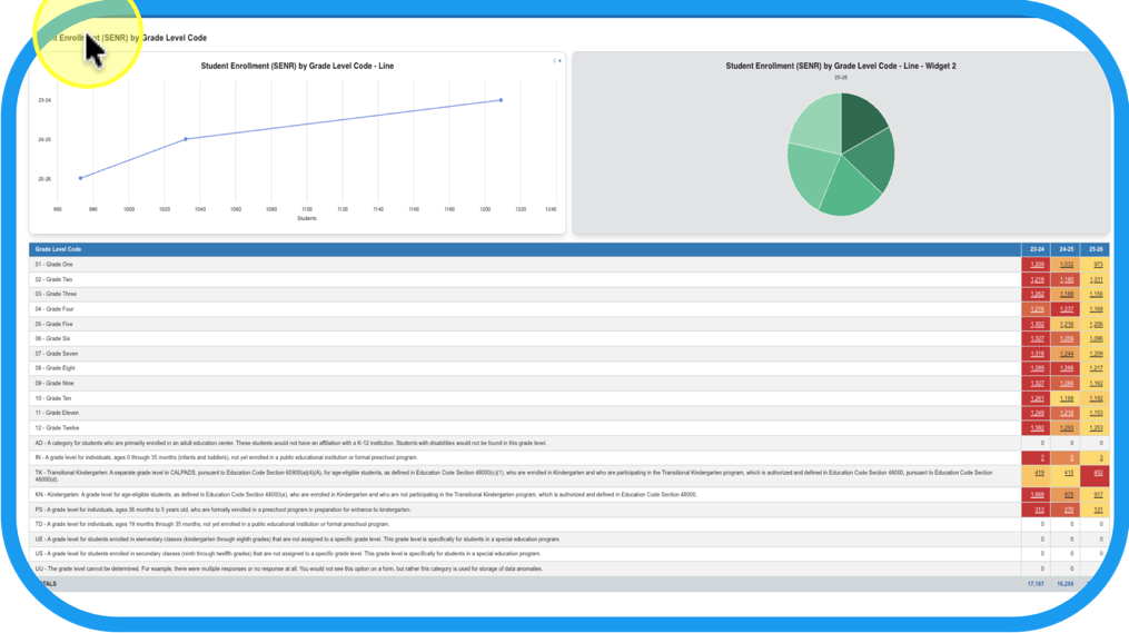
Turn on the charts (graphs), and the heatmap for a full picture.
**ProTIP: Save it as a Custom Report to keep it for the future!