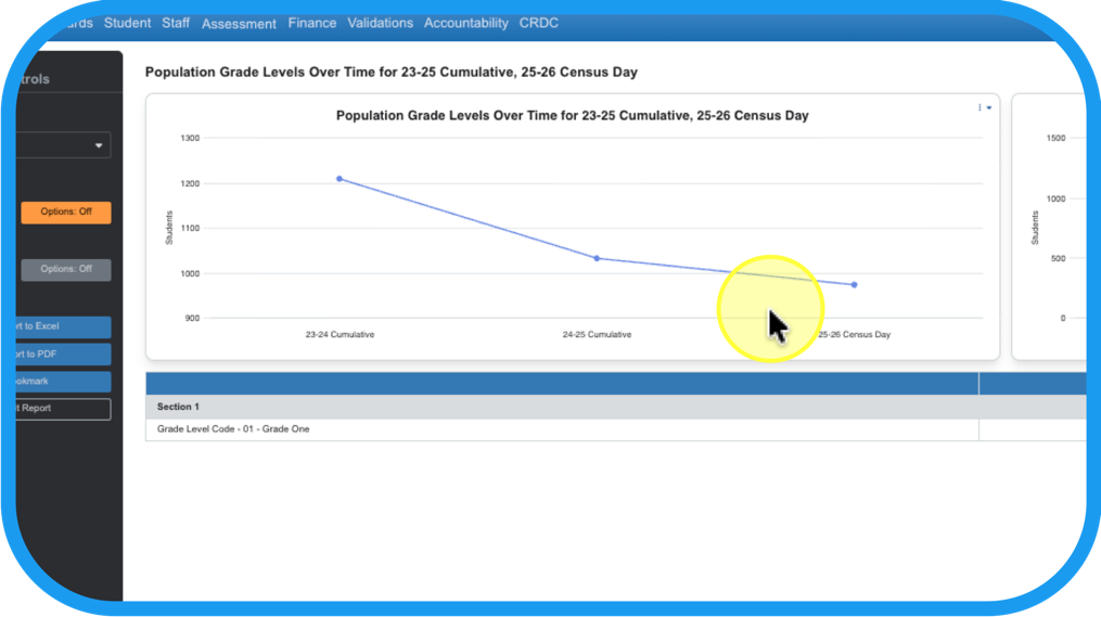
How can you build and share reports and data visualizations using the data in your OnDataSuite?
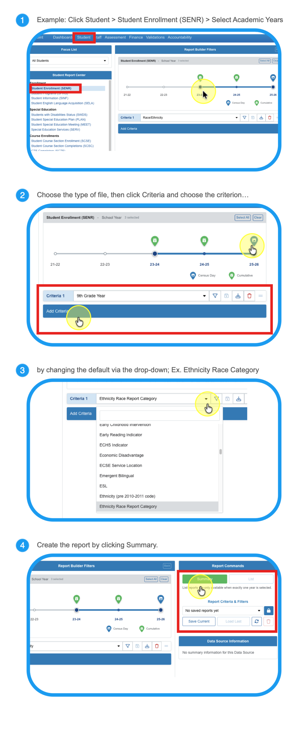
After beginning in the Dashboard, choose the type of data that you want to analyze and navigate there.
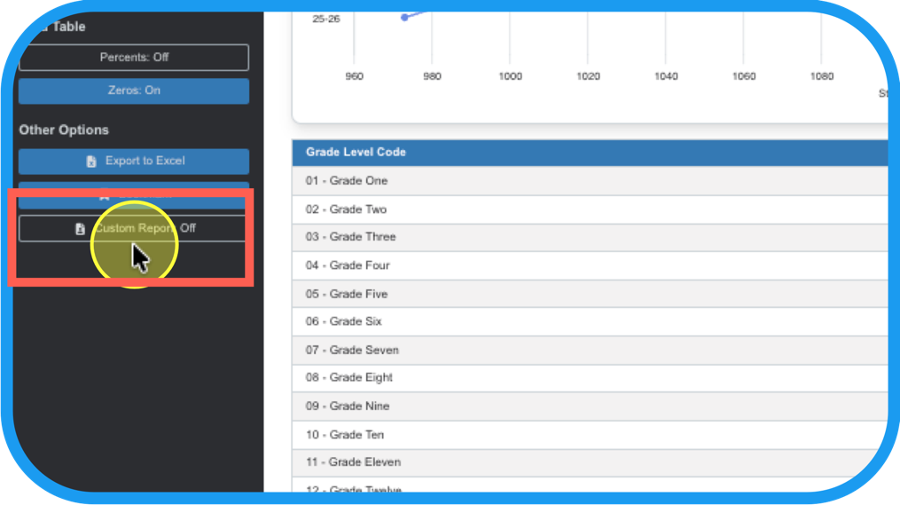
Now that you have pulled the data, create your own personal Custom Report.
Step 5
Turn Custom Report on.
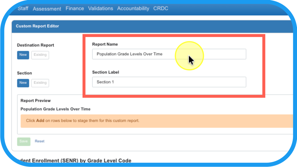
Step 6
Name the Report and label the Section.
Step 7
The criteria chosen in Step 2 will be listed. Add what you want in your report. Click Add and Save!
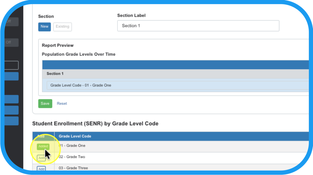
Step 8
Open the custom report.
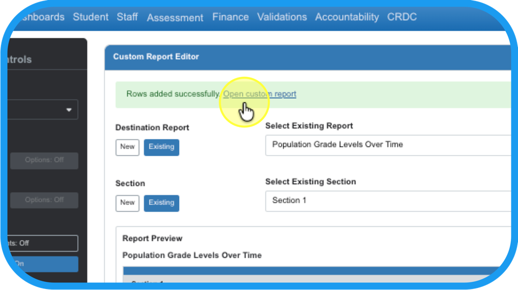
Step 9
Adjust charts the same as in Ad hoc reports, See: Ad Hoc Reports’ Data Visualization Tool
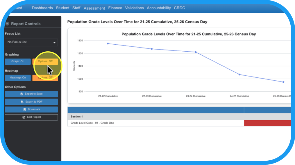
See Article for detailed steps: Ad Hoc Reports’ Data Visualization Tool
Step 10
Click Edit Report to add or hide more years to the data table (or heat map), and…
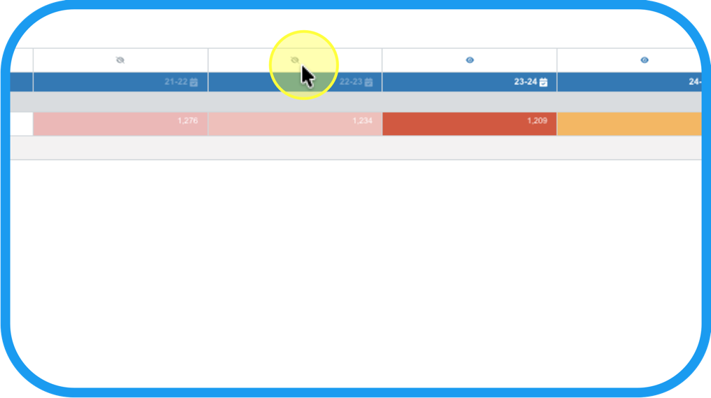
Step 11
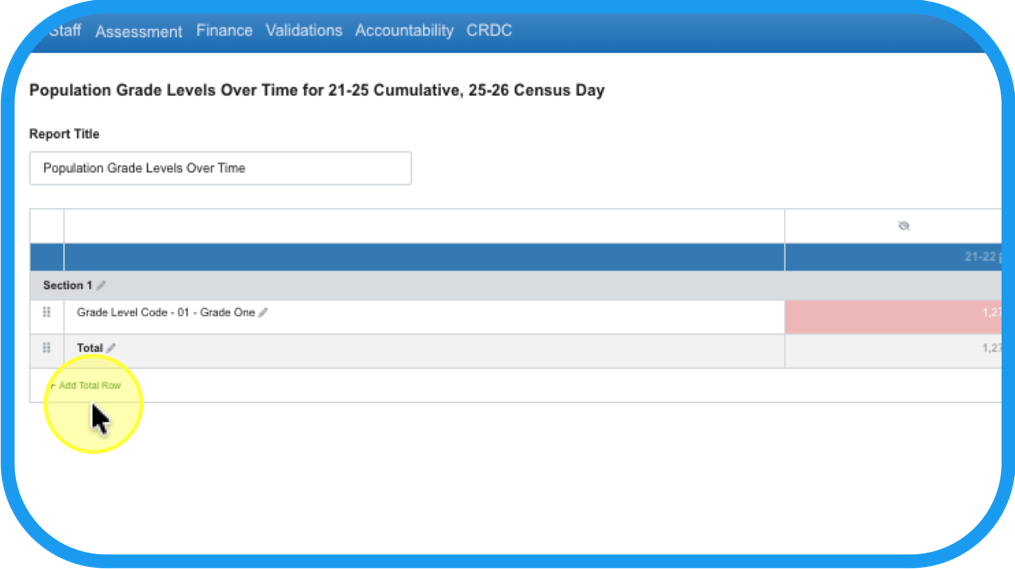
there is also an option to add Total Row. Duplicate that Total Row and adjust its position to create subtotals.
Step 12
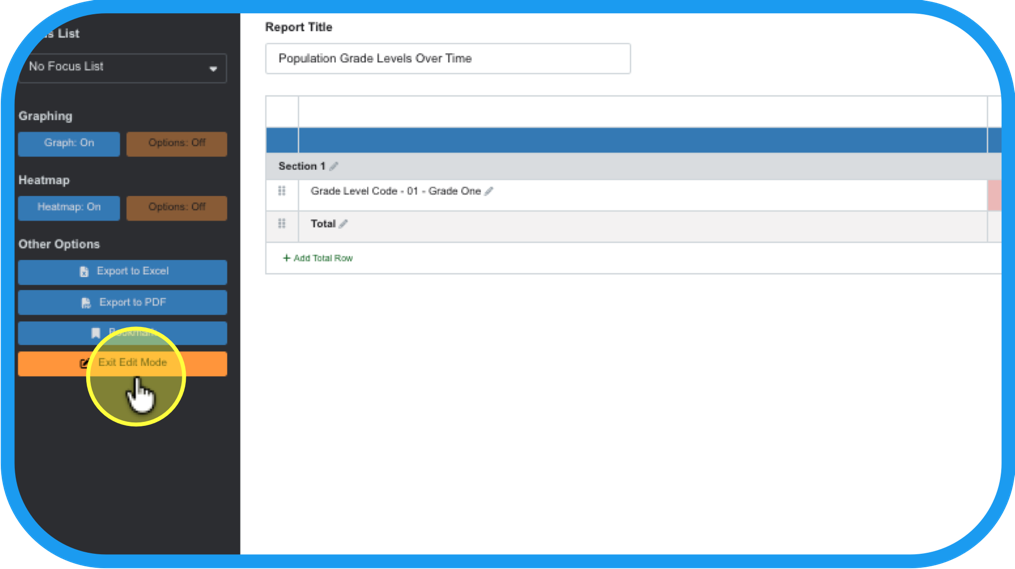
When editing has been finished, Exit Edit Mode.
Step 13
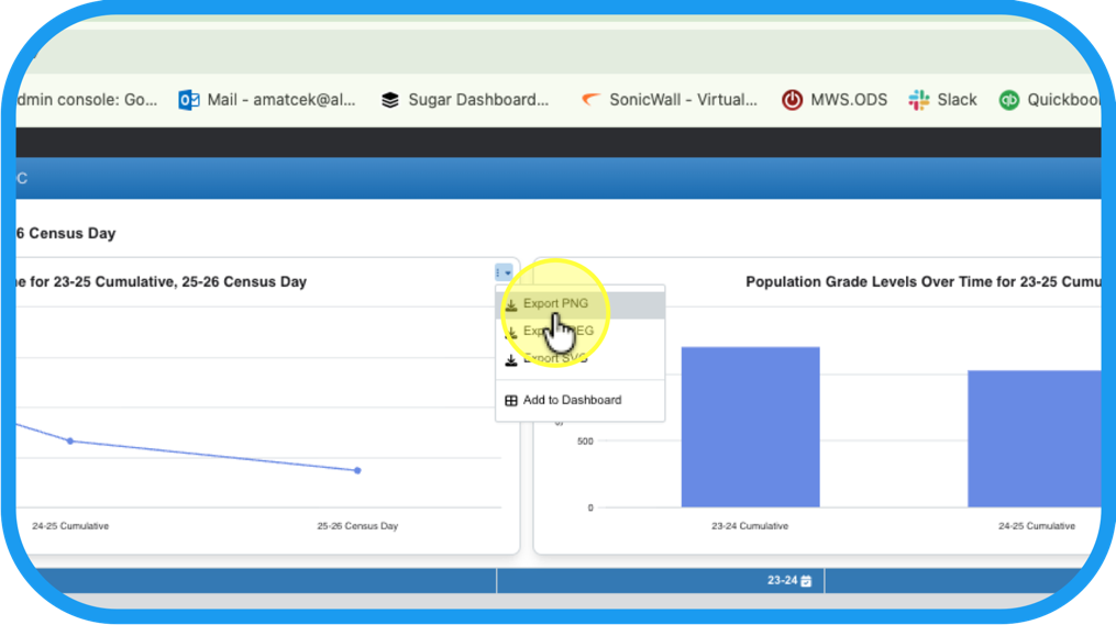
Export a png to share one of the charts as a hand out or in a presentation.
Step 14
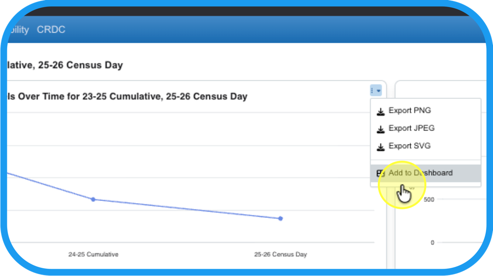
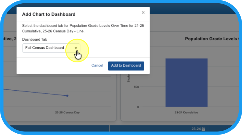
Add the charts to your Dashboard to keep it handy and curate it alongside other charts.
Step 15
Organize it by sending it to the appropriate tab in your My Dashboards.
Step 16
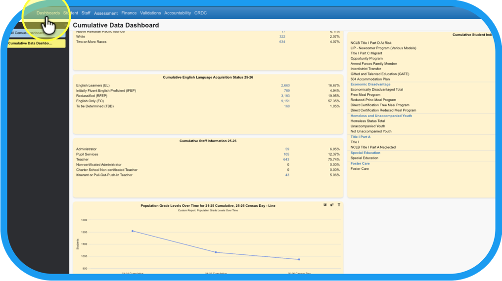
It will be located in your Dashboards tab as a widget.
Step 17
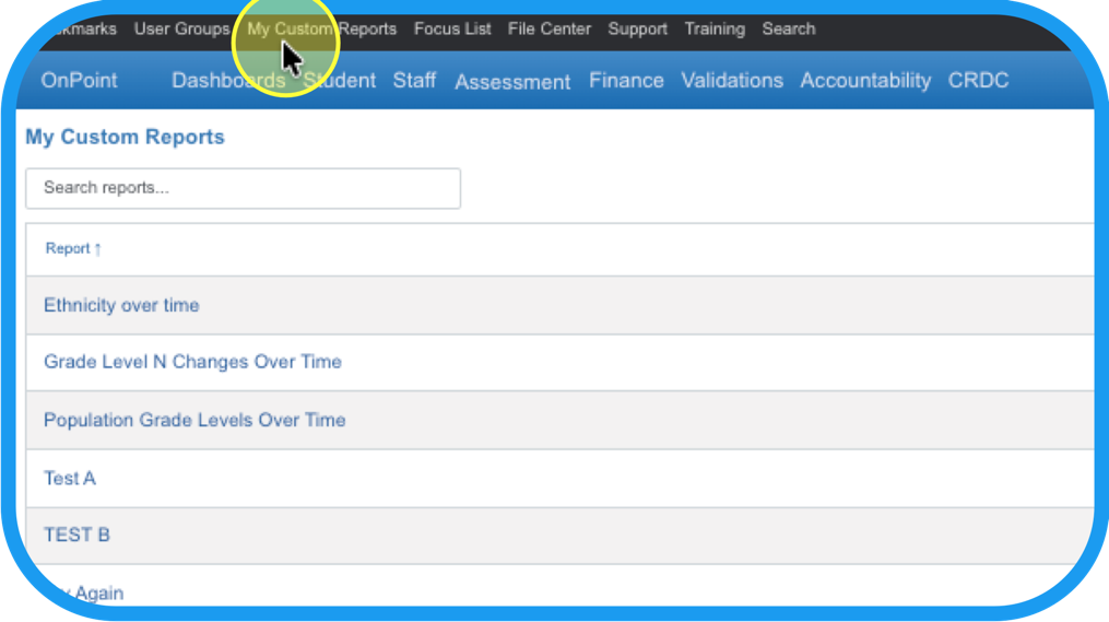
Click on My Custom Reports and find the custom reports you have made.
Step 18
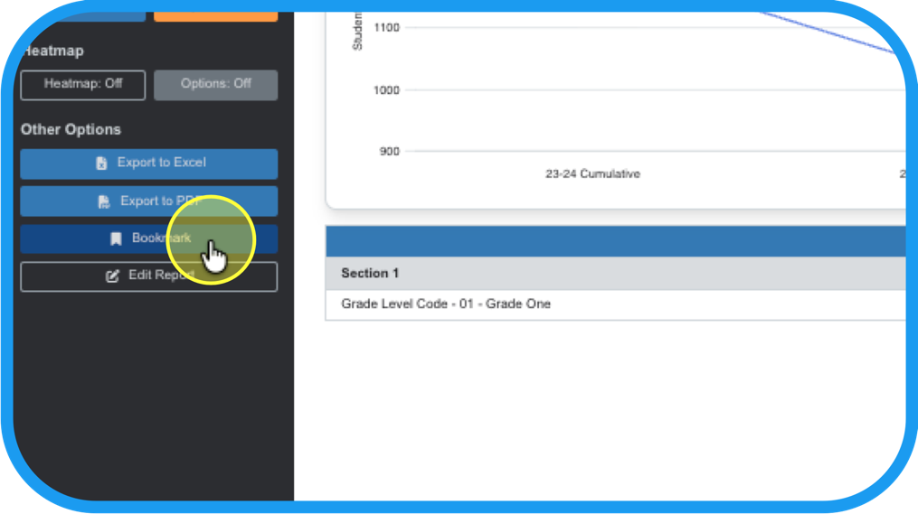
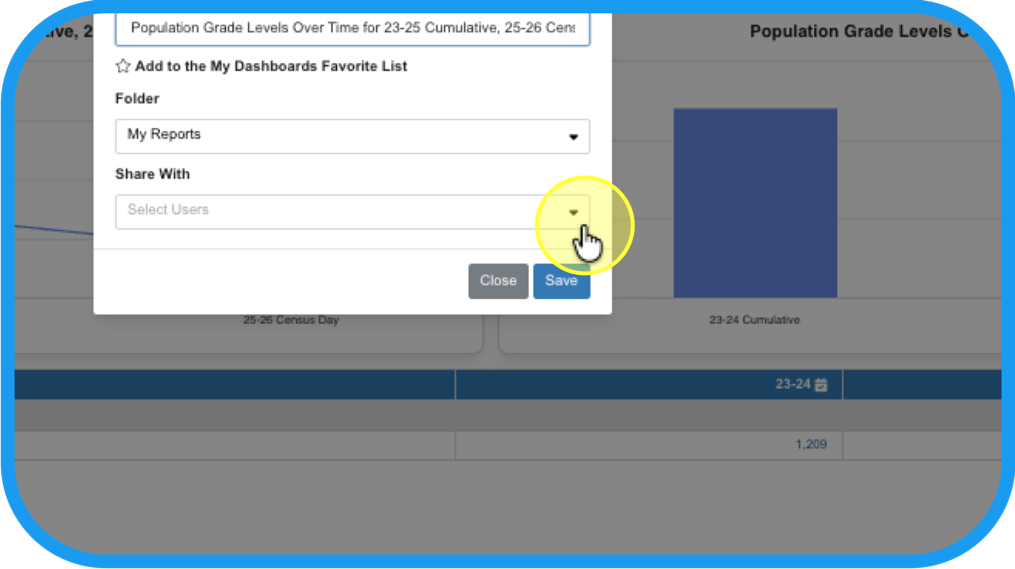
Share the report by returning back to it; making a bookmark…
Step 19
and sharing it with the specific users or user groups you have set up; Ex. C&I Dept.
Step 20
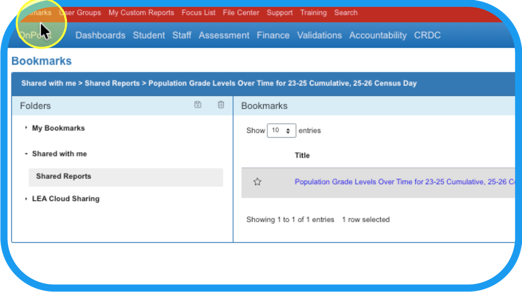
It will appear in their Bookmarks, under Shared with me.
Step 21
The user or user group whom you shared with, will also be notified by email!